
While design is constantly evolving and trends come and go, there are rules in the industry that never seem to go away.
Now I know someone people will already be thinking ‘rules are meant to be broken’, and sometimes that is the case but it is important to at least consider the design rule before breaking it.
Here are the 10 rules I always consider when designing a space:
r u l e 1 : m e a s u r e y o u r s p a c e
Before you go ‘well duh’, this is a really important rule in Interior design, so many people forget the basics sometimes when designing. You can get caught up with everything you want to put in a room, but you need to know if its all going to fit.
My top tip, is to draw your room out to scale, then when you are planning your furniture you can draw templates out to scale and arrange them in the drawn room. This way you can see how things will work together, you wouldn’t want to ruin all your hard design work by making the room feel cramped and small.

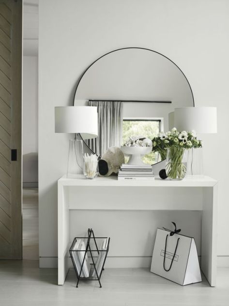
r u l e 2 : d e c o r a t e t h e w a l l s
Unless you are purposely intending your walls to be bare you need to look at how you are going to decorate them. You should decorate your walls to reflect your personality and what you love. Even adding just one statement artwork, mirror, or statement wallpaper walls can enliven your space and make it extraordinary.
Don’t be afraid to be bold and make a statement – Its your home, your rules.
r u l e 3 : c o n s i d e r y o u r n e g a t i v e s p a c e
Sometimes, less is more. In design, the negative space is the area that’s not taken up by any subject. Most commonly, this is the white area on your walls. Its tempting to fill every space with a subject, but sometimes, the negative space speaks for itself.
Im not saying you need to design blank spaces in your room, It’s about looking for spots that look great even when they’re empty.

r u l e 4 : s y m m e t r y
Have you ever walked into a room that just felt right? It might be because of its gorgeous color scheme or furniture selection, but it also has a lot to do with the room’s symmetry.
Symmetrical design create a more calming and visually pleasing space as opposed to an asymmetrical one.
To achieve symmetry you need to find the focus point in the room, this could be a fireplace, a bed in a bedroom or the dining table in a dining room. Then you must balance key pieces either side of the focal point.
Now symmetry should be used for the main pieces but adding asymmetry brings visual interest and a more relaxed feel to your home. If you have a bookcase either side of your focal point you should style the shelves asymmetrically. Too much symmetry can sometime create a clinical space so you must get the balance right.

r u l e 5 : l a y e r l i g h t i n g
Adding different types lighting can give your room dimension. Start with ambient lighting in each room, then consider how you can use task and accent lighting. Having a massive statement light is great but the room will fall flat if this is your only light source.
- Ambient: Its also called general lighting, and its the overhead lighting meant to evenly illuminate a room.
- Task: As its name suggests, task lighting is meant to light a specific task. A lamp in the living room might light a reading area. Under-cabinet lights in a kitchen serve as task lights for countertops.
- Accent: Accent lights are meant to highlight a particular object. You might see them on painting, for example.


r u l e 6 : r u l e o f t h r e e
This is a rule that I ALWAYS follow. I use it comes to accessories, art work, candles and much more.
Odd-numbered groupings create more visual interest than even numbered groupings. In particular, three seems to be the ideal number for a grouping. It helps to have groupings of objects in varying heights, shapes and textures.

r u l e 7 : p l a y w i t h s c a l e
Have fun with scale in your interior, don’t be afraid to go supersized with certain aspects of your decor.
A great example of this is with your lighting. You could have a large statement light above a dining table, this will draw the eye and become a feature in the space. To make sure that a large light for example doesn’t take over the space you should compliment the larger light with smaller lighting around the rest of the room.

r u l e 8 : b r i n g i n s o m e l i f e
As a general rule I always incorporate some sort of plant into the interiors I design. Whether is real or fake it doesn’t matter, a plant just brings a touch of vibrance in its colours and textures.
You can also use plants to accessories a room, but don’t forget the rule of three. This applies with plants too.
For help with what plants to put into your home, you can look back at my ” 9 Easy to care for Houseplants’

r u l e 9 : m i x a n d m a t c h t e x t u r e s
Leather, crushed velvet, or silk — the list goes on! Spruce up your decor by mixing and matching textures. Pairing different materials together and finding the perfect match is all part of the fun.
A mix of textures also adds depth and interest into a space.

r u l e 1 0 : a v o i d c l u t t e r
Last but definitely not least, keep your house clean and tidy.
Use different storage techniques to hide away the clutter such as shelving and storage baskets.

xoxo![]()
